Tuesday, May 23, 2017

Final Blog Post

Quarter Four Project

      For our final project we had to create a project a product and sell it. Our product was called the Lingua and it was a microphone that could  translate languages in real(ish) time. We had the entire quarter to work on it. Our group wasn't the best at staying on task and thoroughly making sure everything was done.We were put into groups based on our animal personality traits and our Myers-Briggs type.  We all didn't agree very well and we got off topic easily.  By the end of our project we had almost gotten everything done, except for the website.  None of us were very confident in our website building abilities, so we put it off for as long as we could. When we would go to work on it individually, we wouldn't really know what to do. Needless to say, the website was the hardest part of our project. I learned al to about working in a  group with people who are hard to get along with and people who aren't always on task. I learned a lot about trying to keep people on topic, working, and how to scream on the inside.

Presentation  

     When we were presenting for the first time, we were told to memorize, finish our website and not bash other companies in our presentation. Throughout the quarter, we had am mini rivalry with another group called the "Speaker". We would both continuously hate on each other in a fun way. by the time presentations came, we both had each other in them in some way or another. In our presentation, I gave myself the honor of bashing on their product. I was going to take it out, but they put my name in their video. When we had to show our video and website, neither were finished. Well, we had a video, but it was a seven second clip of Evan fake falling over the railing. No product, no addressing what we were selling, no nothing. We pulled up a save second clip and showed it to the class. At least by the time we had to actually present, we had a real video and a mostly finished website. 

Opinion

     I enjoyed working on the project, but I didn't like our actual product. After we had chosen our product, we found out that i was already a thing. And at that, the real product was better. It's not fun working on a project that you aren't proud of. But, we did it and and we finished it. 

Time Management 

     For the first quarter, we weren't the best with time management. As a group, we weren't always on task. It took us a long time to finally get our 3d animation done and we had one person doing the 2d animation and we didn't see it until we were finished with the rotation. I feel like our 2d animation could have definitely been stronger. Our 3d animation he'd too much going on in the background for us to see the actual product.  I tried my best to keep everyone on task, but we argued and got off task and it was hard. We got through planning our video fast, so in the men time we planned our shots out quickly and had time to write up a second commercial. I liked the idea for the second commercial better, but the first one was easier to do. The shots we got for the commercial weren't very good and it made it really hard to edit. I stayed after school times and i came in in the morning for a week straight. I have the programs at home so I can take the projects home. I should learn how to bring home all of the stuff instead of just the file like I did. 

Strengths and Improvements

     I would say my strengths are in editing and keeping people from fighting. That actually came in handy a lot because we fought often. I was able to straighten people out and make sure we weren't yelling. 
     I could work on not getting off task when other people are and working through other people's distractions.

     My favorite part of this semester was basically the idea of this project. We all got experience making a product and having to have pride in it and selling it. The hard part was not actually having the pride required to sell your product or be proud of it. If I could go back and change things, I would change our product in a heartbeat. W had had ideas for other things after that that I like a lot more than what we ended up doing, like tattoos that last for a year or change color. After this semester I learned that it's important to be proud of everything you create and do. I would have enjoyed the whole process just a bit more if I had like our product. One goal I would like to set for next year is simple: be proud of everything I create. I honestly cannot believe that the year is already over and I we are going to be sophomores soon. I am very excited for e-Comm next year. 

Project 


Friday, March 10, 2017

CSS And CARP Design

     To finish out the quarter we did another web design project. We had to use Dreamweaver again and this time we had to change up a poem and make it look nicer with CSS and CARP. Hint hint to the title of this blog post. This project felt a lot easier than the last, but maybe it's because I don't remember it too well. The original file looked a lot different than the end project. At the beginning, it just looked like a white screen with a dog and a poem. By the end, it looked like a real website with a background color and a title and everything.

     C- We showed contrast with the black background behind an almost white box holding the poem and dog.
     A- We used alignment to Show the title (which was in the middle) and the normal format for poems which is aligned to the left.
     R- We showed repetition by using the same colors from the dog multiple times throughout the website.
     P- We used proximity by keeping everything close together but far enough apart that you can easily tell where everything is and what it goes with.


      Even after this project, I am still not the biggest fan of web design but I had fun and I learned a lot about working with CSS and CARP. For starters, I learned what CARP stood for, meant, and how to use and demonstrate it. I relearned how to use Dreamweaver and how to write out code. I don't think I want to work in Dreamweaver again, though.  But, I did enjoy it.

Tuesday, February 28, 2017

Name Logo

     Since we started learning about logos, we had to create our own personal logos. We spent a lot of time talking over everything a logo should incorporate and how to keep it simple and precise. I spent a lot of time sketching mine out and I wasn't sure what I wanted to go with.  Out of the four that I had, I ended up choosing one that had half of my name upside down because I thought it was the best out of what I had.
     Little did I know how hard that would be to recreate on Illustrator. It took me about two class periods to work on and finish it. My logo ended up having a fade in all of the letters to make them stand out a bit more. I did not use the colors I had initially wanted to use because they didn't work. I wanted to logo to a lot more woodsy and whimsical than it turned out to be.
     I don't really like the way my logo turned out because I had wanted something pretty different. I like it as a logo, but it really isn't what I wanted to have. If I had had a lot more time and much more advanced graphic design skills, than maybe I would have been able to pull it off. 

Thursday, February 23, 2017

A Bird, A House, A Flower

For our next assignment, we had to show variety. We had to make either 20 birds, houses, or flowers. First we had to sketch them all out and then we had to recreate one of them in Illustrator.You had the choice of using color or not.
For my sketch, I drew 20 birds. I drew them all around a tree and a bush because I didn't feel like just putting them in squares or something similar. It was strange having to draw 20 of something but make sure they were all different. I still feel like I could have had more variation in a couple of spots but I like my birds. I recreated a lot of my birds from different pictures. You could add different tags to make the search more specific. That helped  lot with adding variation to the birds.
I recreated one of my easier birds in Illustrator. It looks rather lumpy, but I like it that way. I started drawing it really big on accident, but I just sized it down when I finished. I have been told that if you changed a few small little details it looks a lot like the original Kansas University Jayhawks logo. It's a fat, chubby, lumpy, blue bird with skinny little bird legs. I only used the colors blue and yellow, if you don't count black.
I really like my bird. It's not the best done bird in the world, but it's my bird and I honestly think t'd kind of cute. Frankly, there are a few thinks I would change, but I am going to keep it the way it is. I think I am going to name it Sampson, he looks like a Sampson.

Color Wheel

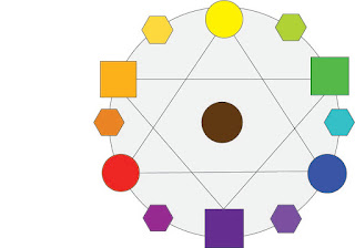
In graphic design we had to recreate a color wheel. We learned about the names of the colors. Well, not like yellow and green, but secondary and tertiary. We learned about different color schemes and which colors could go with which. We also learned how to tell which colors went with which using the names. In our color wheel, we had to show where each color went on the color wheel with brown in the middle, showing how when the colors mixed it created the one in between them. We also had to put the colors in different shapes to show which ones went with what.

Monday, February 13, 2017

My Personality Type

Yesterday we took the Myers-Briggs personality test.  My personality type was INFP, which stands for introvert, intuitive, feeling, and perceiving.  They are people who strongly believe in their values and beliefs and try not to judge people too early. Some famous people with this personality type are William Shakespeare, Audrey Hepburn, Hellen Keller, Kurt Cobain, and John Lennon.

I think this personality type describes me pretty well. A part that was very accurate to me was the fact that they reserve their most authentic thoughts and feelings for people they know well. The part that was a bit off was the  fact that they try to find new outlets for self-expression. It helped me understand a bit more about the things I do in and out of school. I have friends who are each personality type and I think it is good that even though we are all such different people we can all get along.

In any group setting, if I am not the leader, I try to be as useful and helpful as I can.  I basically try to be a right hand man and do whatever needs to be done. usually when the role I am given matches up with my personality type the project goes very smoothly on my end and it gets done. I it does not, the project takes more time and focus and tends to get slightly frustrating, But, it all gets done the same. I have been told many times in the past that I am a "people person", but I certainly am not by any standards. It takes me awhile to get used to, warm up to, and  be able to talk freely to people. I know a girl that used to talk out of turn a lot and it really got on my nerves. We got in trouble quite a few times and I got tired of it. We aren't very close anymore, but now the I think about it, our differentiating personalities might have played a key role.

We also took another personality test. this one told us what kind of animal we were. I got an otter and a golden retriever. The otter is someone who is very sociable and good at making friends. I am not really sure how I got this one because I am not really either of those things. The golden retriever is very loyal and not big on big changes. I feel I relate a lot more to the golden retriever than the otter.

Over the course of this assignment I learned a lot about who I am as a person and what that means for what I'm doing, where I'm going, and how I'm going get there.

Friday, January 27, 2017

First Time With Illustrator

After finishing our first sketch, we moved into Illustrator. We learned how to use the shape tool, the pencil tool, and the shaper too. For the first project, I made an owl. We sketched it out first so we knew what we were doing. I used smooth lines and stars, for texture, to make my owl. Even though it doesn't look like an actual owl, I like to believe its recognizable. I used mostly gray colors, but I gave it yellow eyes and a red bowtie. I sued curvy shapes and made sure it filled up the space. I didn't add too much depth, but I wanted it to be that way. I did, however, make the wing and feathers a darker gray then the body.

I had a bit of trouble getting used to Illustrator, as moving to a new platform isn't always easy. We watched video tutorials to learn how to use the tools, but it tok a bit to get them to work the way I wanted. Whenever I tried to use the eraser, it would add lines where the eraser had gone over. Once I finally got the hang of it, it wasn't too bad. I tok awhile trying to get the body done, but everything went by a lot faster after that.

For the next project, we used the shaper tool. We had to recreate what we had seen in the video to get used to using it. Mine was giving me a hard time because it wouldn't erase certain lines I was trying oh so hard to get rid of. After awhile I just turned it in as is. I had time left over, so I decided to recreate the Colorado flag, because a step in the process reminded me of it. Though that one seemed easier, it still gave me a bit of a hard time. I couldn't seem to get the lines in the background to go straight across, but I got them as close as I possibly could.

Its been two weeks since we started using Illustrator. Im happy to say that I am starting to warm up to it. I has a very simple design the makes it good for beginners and experts to use. I am excited to see what the rest of the quarter has in store for us in graphic design and what the rest of the semester has in store for us in e-Comm.