Tuesday, February 28, 2017

Name Logo

     Since we started learning about logos, we had to create our own personal logos. We spent a lot of time talking over everything a logo should incorporate and how to keep it simple and precise. I spent a lot of time sketching mine out and I wasn't sure what I wanted to go with.  Out of the four that I had, I ended up choosing one that had half of my name upside down because I thought it was the best out of what I had.
     Little did I know how hard that would be to recreate on Illustrator. It took me about two class periods to work on and finish it. My logo ended up having a fade in all of the letters to make them stand out a bit more. I did not use the colors I had initially wanted to use because they didn't work. I wanted to logo to a lot more woodsy and whimsical than it turned out to be.
     I don't really like the way my logo turned out because I had wanted something pretty different. I like it as a logo, but it really isn't what I wanted to have. If I had had a lot more time and much more advanced graphic design skills, than maybe I would have been able to pull it off. 

Thursday, February 23, 2017

A Bird, A House, A Flower

For our next assignment, we had to show variety. We had to make either 20 birds, houses, or flowers. First we had to sketch them all out and then we had to recreate one of them in Illustrator.You had the choice of using color or not.
For my sketch, I drew 20 birds. I drew them all around a tree and a bush because I didn't feel like just putting them in squares or something similar. It was strange having to draw 20 of something but make sure they were all different. I still feel like I could have had more variation in a couple of spots but I like my birds. I recreated a lot of my birds from different pictures. You could add different tags to make the search more specific. That helped  lot with adding variation to the birds.
I recreated one of my easier birds in Illustrator. It looks rather lumpy, but I like it that way. I started drawing it really big on accident, but I just sized it down when I finished. I have been told that if you changed a few small little details it looks a lot like the original Kansas University Jayhawks logo. It's a fat, chubby, lumpy, blue bird with skinny little bird legs. I only used the colors blue and yellow, if you don't count black.
I really like my bird. It's not the best done bird in the world, but it's my bird and I honestly think t'd kind of cute. Frankly, there are a few thinks I would change, but I am going to keep it the way it is. I think I am going to name it Sampson, he looks like a Sampson.

Color Wheel

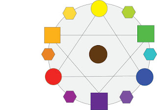
In graphic design we had to recreate a color wheel. We learned about the names of the colors. Well, not like yellow and green, but secondary and tertiary. We learned about different color schemes and which colors could go with which. We also learned how to tell which colors went with which using the names. In our color wheel, we had to show where each color went on the color wheel with brown in the middle, showing how when the colors mixed it created the one in between them. We also had to put the colors in different shapes to show which ones went with what.

Monday, February 13, 2017

My Personality Type

Yesterday we took the Myers-Briggs personality test.  My personality type was INFP, which stands for introvert, intuitive, feeling, and perceiving.  They are people who strongly believe in their values and beliefs and try not to judge people too early. Some famous people with this personality type are William Shakespeare, Audrey Hepburn, Hellen Keller, Kurt Cobain, and John Lennon.

I think this personality type describes me pretty well. A part that was very accurate to me was the fact that they reserve their most authentic thoughts and feelings for people they know well. The part that was a bit off was the  fact that they try to find new outlets for self-expression. It helped me understand a bit more about the things I do in and out of school. I have friends who are each personality type and I think it is good that even though we are all such different people we can all get along.

In any group setting, if I am not the leader, I try to be as useful and helpful as I can.  I basically try to be a right hand man and do whatever needs to be done. usually when the role I am given matches up with my personality type the project goes very smoothly on my end and it gets done. I it does not, the project takes more time and focus and tends to get slightly frustrating, But, it all gets done the same. I have been told many times in the past that I am a "people person", but I certainly am not by any standards. It takes me awhile to get used to, warm up to, and  be able to talk freely to people. I know a girl that used to talk out of turn a lot and it really got on my nerves. We got in trouble quite a few times and I got tired of it. We aren't very close anymore, but now the I think about it, our differentiating personalities might have played a key role.

We also took another personality test. this one told us what kind of animal we were. I got an otter and a golden retriever. The otter is someone who is very sociable and good at making friends. I am not really sure how I got this one because I am not really either of those things. The golden retriever is very loyal and not big on big changes. I feel I relate a lot more to the golden retriever than the otter.

Over the course of this assignment I learned a lot about who I am as a person and what that means for what I'm doing, where I'm going, and how I'm going get there.